So I watched Your Friendly Neighborhood Spider-Man (that’s going to be a clunker to type out every time, let’s just call it YFNSM) and I liked it very much. I do have some quibbles with it, like the removal of Peter’s traditional origin story and the inexpressive animation, but it was a lot of fun.
Unfortunately, only two episodes are out at the moment and Harry only has one short scene in them. But it establishes him as being Rich, Nice, and prone to being a damsel in distress.
We’re bound to see more of him next week, especially with Norman playing such a prominent role, but in the meantime I want to show you this concept art from the end credits!
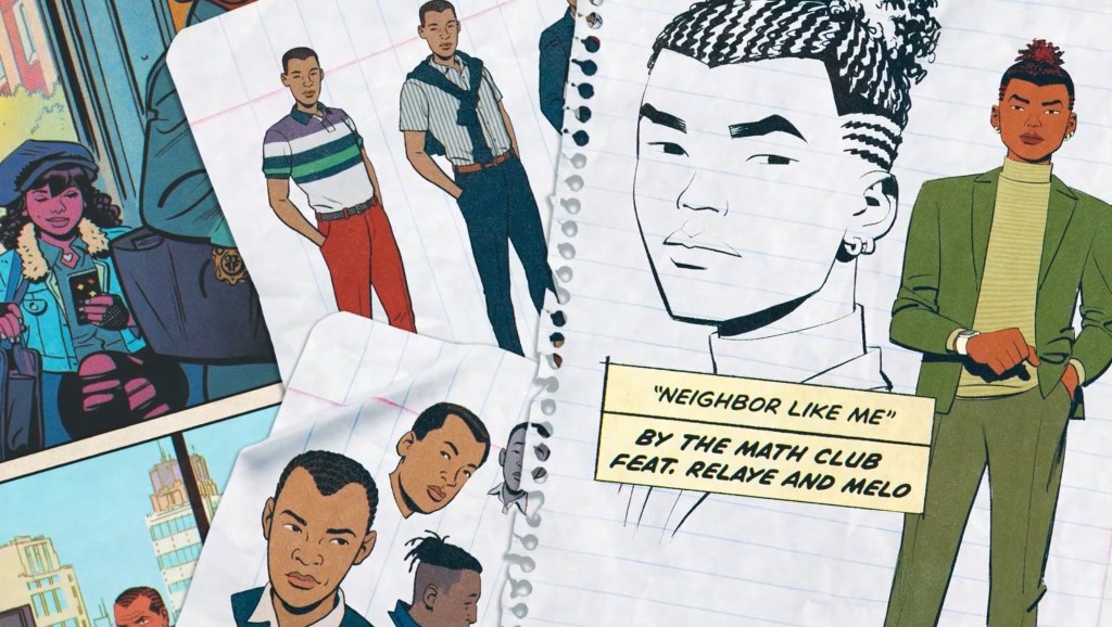
The unused Harry designs are there on the left. And I gotta admit, I like them just that little bit more than what we got? I just feel like Harry should always have a nervous, unsure look to him and that’s what I’m getting from the unused designs. What do you think?

I think and hope that as the series progresses he (and other people like Peter?) would change to resemble their concept art overtime. I know that the showrunner’s really attentive to details and I think it would be interesting if as the seasons go by, Harry looks more and more like his father. So by the time college comes around Harry’s going to look straight out of 616.
LikeLiked by 1 person
That is a GOOD IDEA
LikeLike
Harry conceptual designs looks old for being a teenager in his 15, it would be better having it at the collegue I think 😊
And my… thst Sokka hairstyle is kinda weird for him 😅 Oh, there’re promotional teasers of every main character and Harry has one too 😉
LikeLiked by 1 person
We need a review of the show.
LikeLike
oh, you are so right. i don’t dislike the character designs they went with, i like the show, but they could’ve been that much better. especially doc ock.
LikeLiked by 1 person
[…] been an interesting month for Harry fans. We got to know a new variant of him in Your Friendly Neighborhood Spider-Man and we got another issue of Ultimate Spider-Man where Harry has a big role to […]
LikeLike